
Each week we jump on free 30 minute social media strategy calls with potential clients to talk about their social accounts. Instagram tends to be a platform that gets a lot of focus and we’ve had the chance to see countless Instagram accounts (the good and the bad). Here are some of the most important (and recurring) Instagram failures we’ve seen, along with real examples so that you can avoid these mistakes on your own account.
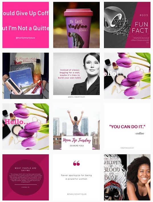
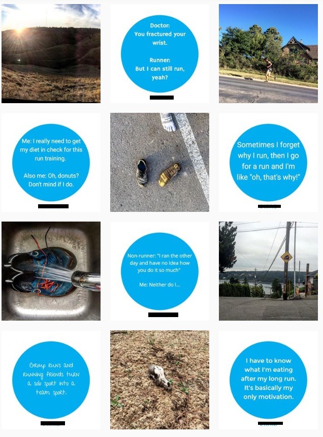
#1: MINIMIZE TEXT OVERLAY
When we spoke to the potential client with the account below, we let them know that the information within the text of their graphics was great but that it should be saved for the caption of the post. They then could have a couple posts with minimal text overlay like the “3 Reasons We love Carrots” or a simple quote card. However, too much text clutters up an Instagram feed and makes it look crowded and messy.

#2: FEATURE PRODUCT IMAGERY
When looking at the potential client examples above or below, can you tell us what they are selling? We couldn’t either. We had to do research to figure it out in order to prepare for a call with them but as we pointed out to both clients, a consumer doesn’t have the desire or time to do that. There are too many easy and targeted product options on social so even if your product is unique, if you don’t instantly and visually express why it is different, people will move on to something else. That means you need to have product imagery (or imagery of your service). Whether you hire a professional photographer or DIY photo shoots, you need eye-catching product imagery throughout your feed.
If you are still in the product development stage, unless you have imagery of your product, it doesn’t make sense to get started on Instagram as solely curating imagery for a product based business doesn’t work on IG. Wait until you have images of your product to work with before you begin posting.
#3: SHOWCASE A COHESIVE BRAND
This goes along with both of the above errors as both of those Instagram failures don’t allow you to showcase a cohesive brand. There needs to be a common thread throughout the feed in terms of color, fonts and imagery. If you don’t show consistency throughout your feed, it will look chaotic and visually distracting. Stick with only a couple different fonts and colors to keep things consistent.
You need to have both a very strong sense of what your brand is about (and what it visually looks like) and then making sure to visually reflect that each and every time you post on Instagram. If an image is slightly off-brand, don’t post it. On Instagram, it will easily look out of place and detract from the other great content you are putting up.
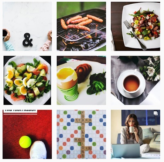
#4: USE BRIGHT IMAGES
We’ve spoken to many influencers who say that the main reason brands book them over other influencers is because of their bright imagery. This holds true for consumers. When scrolling through a sea of Instagram posts, people will pause at a really beautiful, bright image. Make sure to learn the basics of lighting for DIY photography; it will make a world of difference.
#5: OPTIMIZE FOR THE FEED
One item we brought up to the potential client above was making sure to optimize their content for people viewing it on their feed. Many of their text based posts were cut off when viewed from their profile.
Think of your profile like your website on Instagram. If someone hears about your brand or sees one of your posts and wants to check you out, they will head back to your profile to get an overview of your brand. This means that your feed should be optimized for people viewing your content from there (which means no cut-off text).
#6: NO MORE COLLAGE POSTS
Collage posts were “a thing” when Instagram didn’t give you the ability to include multiple images within one post. A collage was helpful to showcase several images within a theme but unfortunately, always looked cluttered on the feed itself. Now Instagram allows you to add multiple images as a slideshow so that you can both upload several images, while keeping your feed clean.

An important addition to this and really the point behind this fail is that it is important to stay on top of ever changing Instagram features.
What was once a popular Instagram trend yesterday may be obsolete tomorrow. Instagram has seen dramatic grow over that last couple years with a whirlwind of app updates and new features. It is important that your brand stays ahead of the curve to stay relevant and to be able to stay connected with your audience with the current tools they are using. Utilize Instagram Stories,
highlight those Stories, experiment with IGTV and take advance of the host of options Instagram has to offer brands trying to reach their target audience.
Again, these are ever changing. Most likely, if you are reading this months from now, some of these suggestions will be outdated 🙂
#7: FORGET STOCK PHOTOGRAPHY
Below are two recent Instagram posts for a potential client. They are very “stock photo-y” and not the right imagery type for Instagram. If you can and it’s in the budget, obviously original photography is best. However, we understand the appeal of stock photography and if you’re going to use it, make sure to 1.) mix it in with other content and 2.) look for stock photography that doesn’t scream “STOCK PHOTOGRAPHY”. Images should look natural and unstaged.


#8: IT’S NOT ALL ABOUT YOU
As an addition to making sure to showcase your product (#2), make sure you also don’t ONLY post about your product. Only posting product shots, customer testimonials and your logo over everything on your feed will quickly lead people to hit the “Unfollow” button.
Create buyer personas and get into the mind of your audience to determine the type of content that would really appeal to them and that they would want to continue to follow. Again, since Instagram is such a saturated space, it is important to provide your audience with valuable content. If you’re selling vegan treats for instance, maybe provide your audience with yummy vegan smoothie recipes for the summer or how to stick to a vegan diet when out at a restaurant. Think about the questions your audience has and provide them the answers via social. For instance, we’re constantly asked by clients on how they can revamp their Instagram accounts; we used that recurring question (and all the client pain points we discover) as inspiration for our social content and this guide.
#9: DON’T USE GRAINY IMAGES
Since Instagram is a visual platform, the main component to an Instagram post is the image itself. Never post blurry or grainy images on Instagram; your images should be high quality and clear. End of story 🙂
#10: BALANCE YOUR CONTENT
It’s important to balance your content types to create a visually appealing Instagram feed. You don’t want your feed to be a ton of quote cards, nor do you want it to only be product imagery. Rotate between graphically design posts, lifestyle imagery, product imagery, influencer collaborations or user generated content. Determine the content types you have to work with and make sure to balance all of those categories.
Ready to up-level your Instagram account but don’t know where to start? Schedule a FREE call with us and let’s chat!